SFK
2020
BRAND RENEW
GRAPHIC DESIGN
KYLA GU, JUNE LI
STRATEGY
KYLA GU, JUNE LI
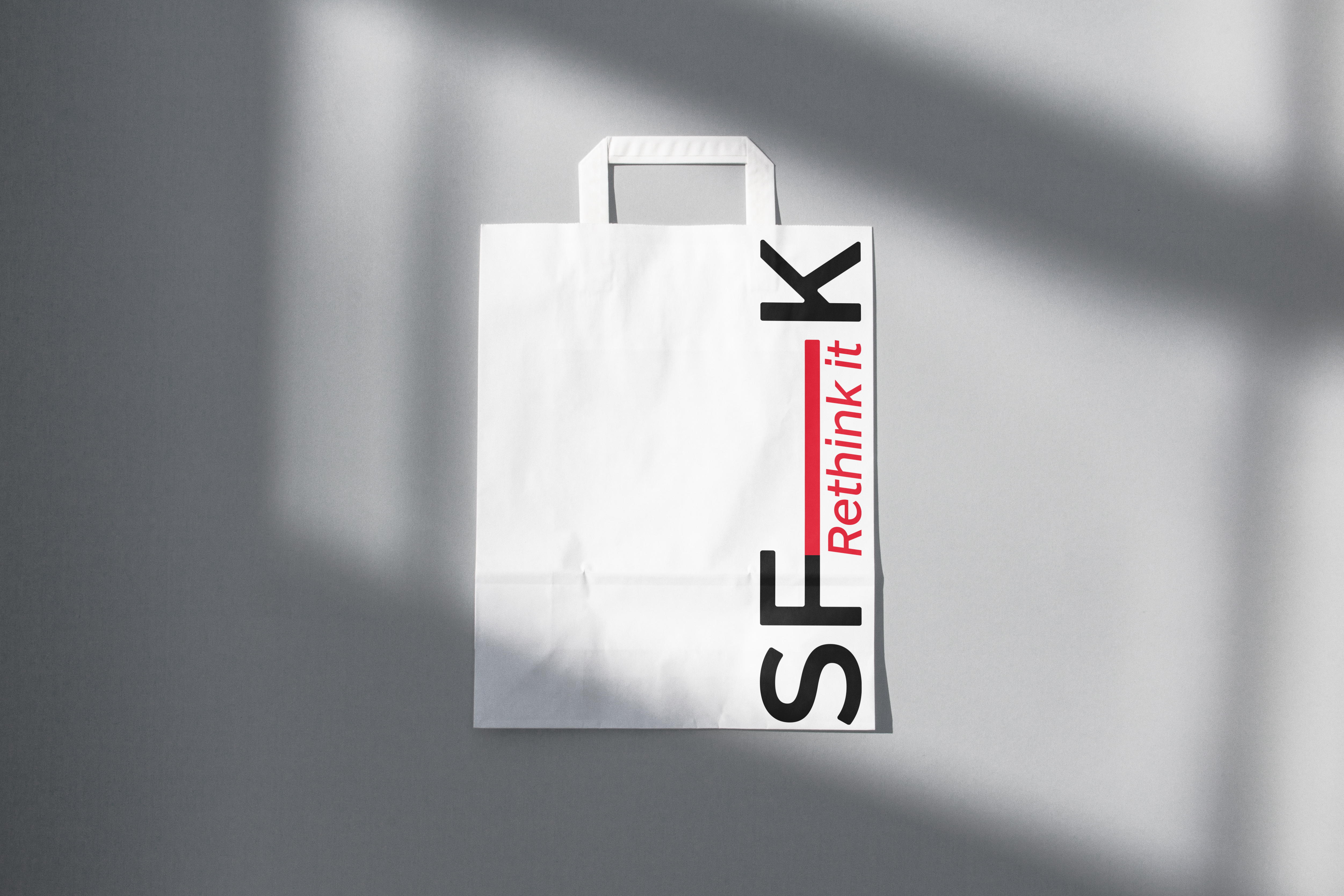
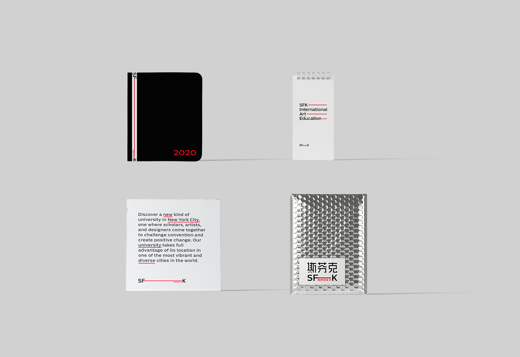
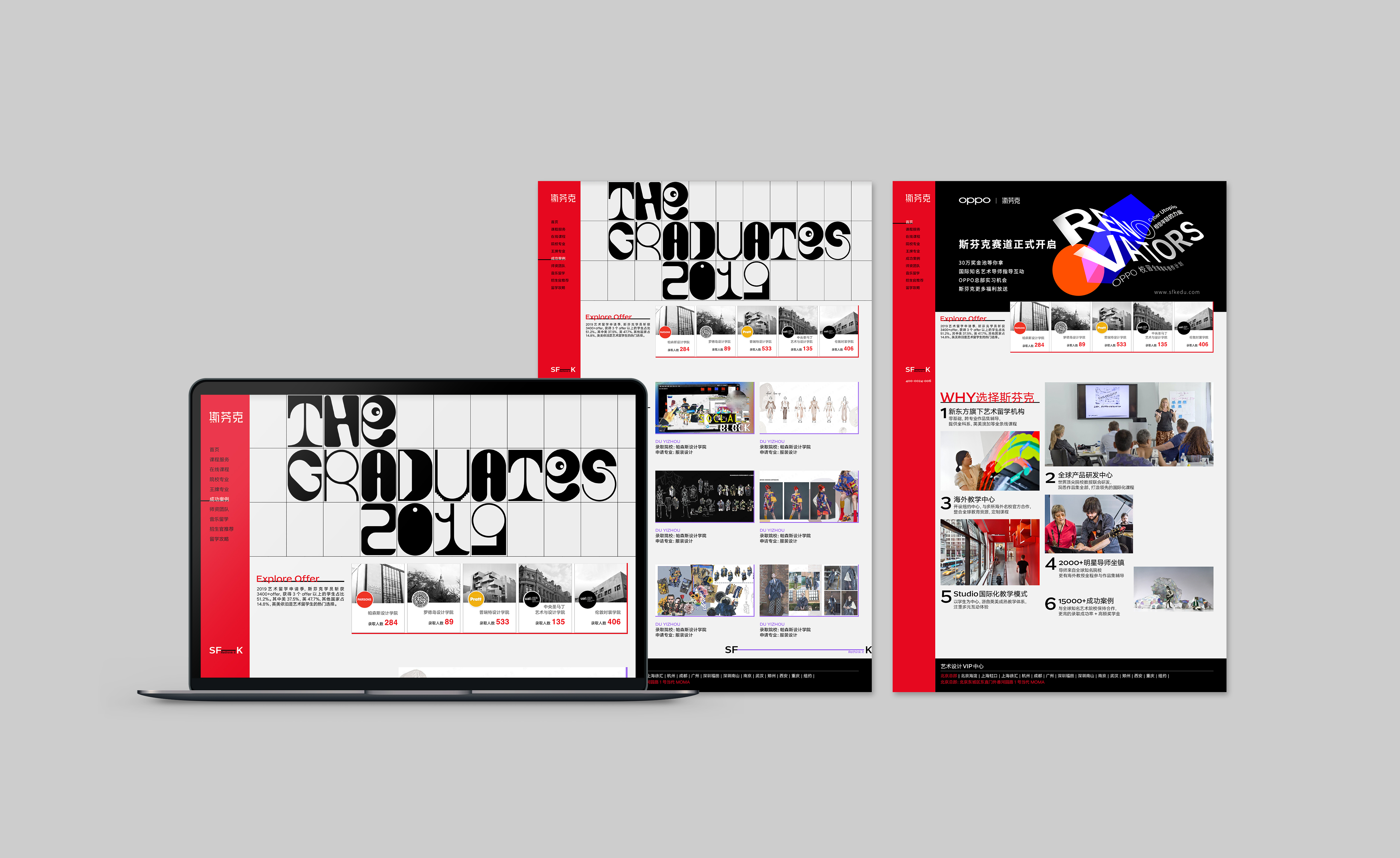
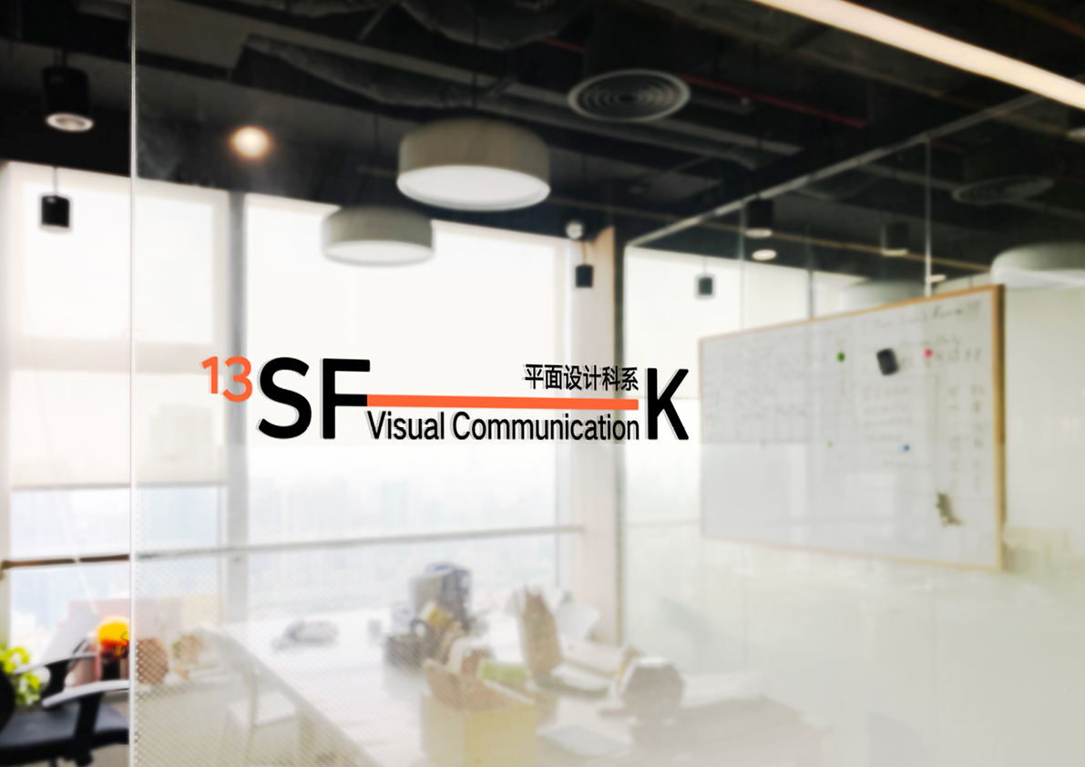
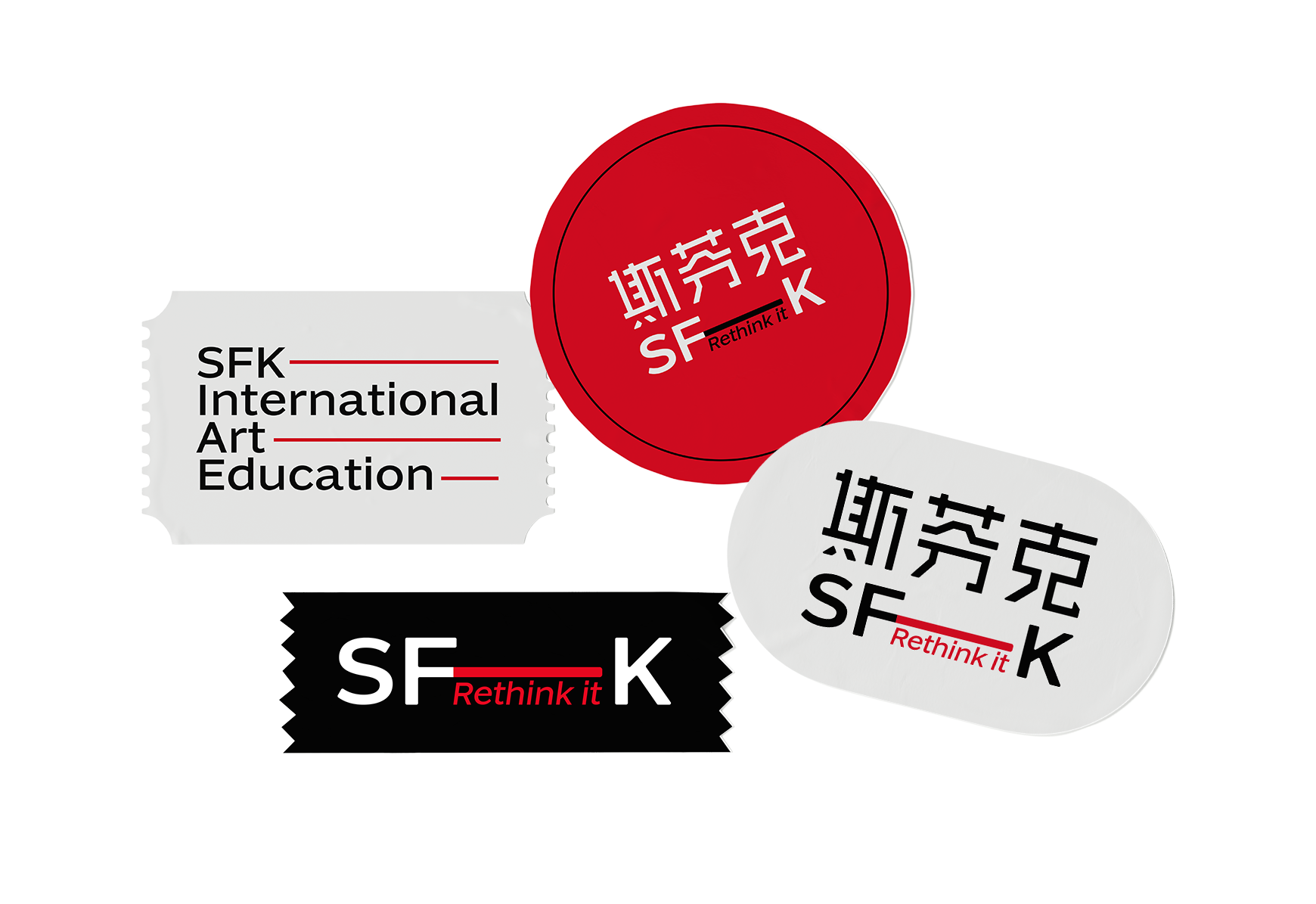
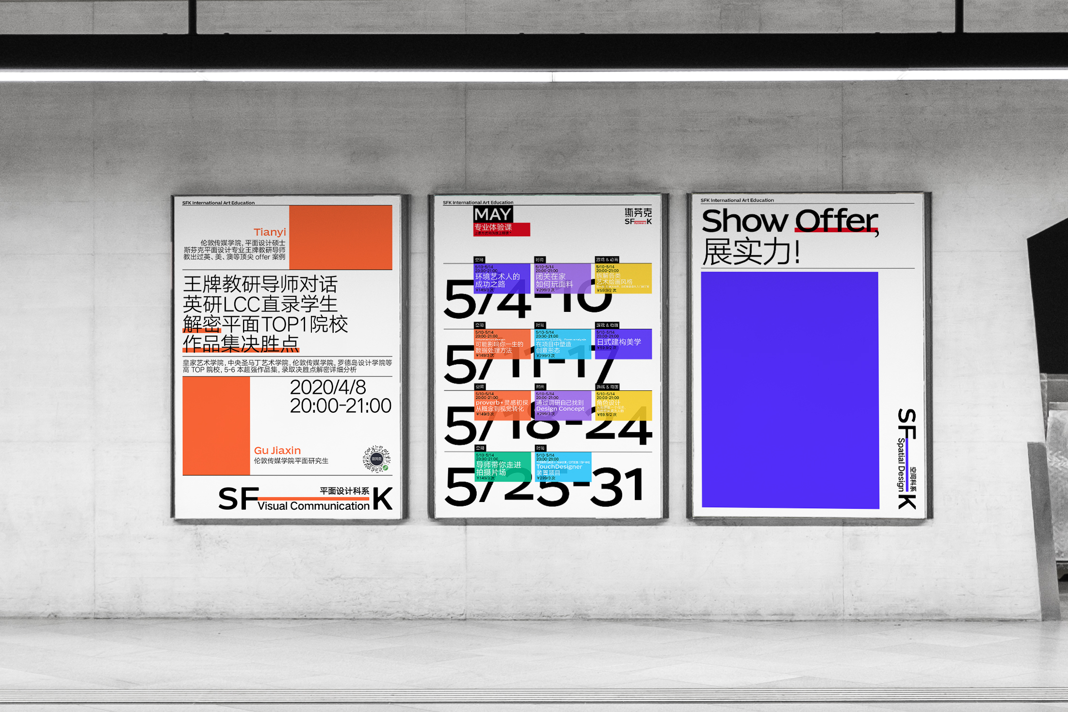
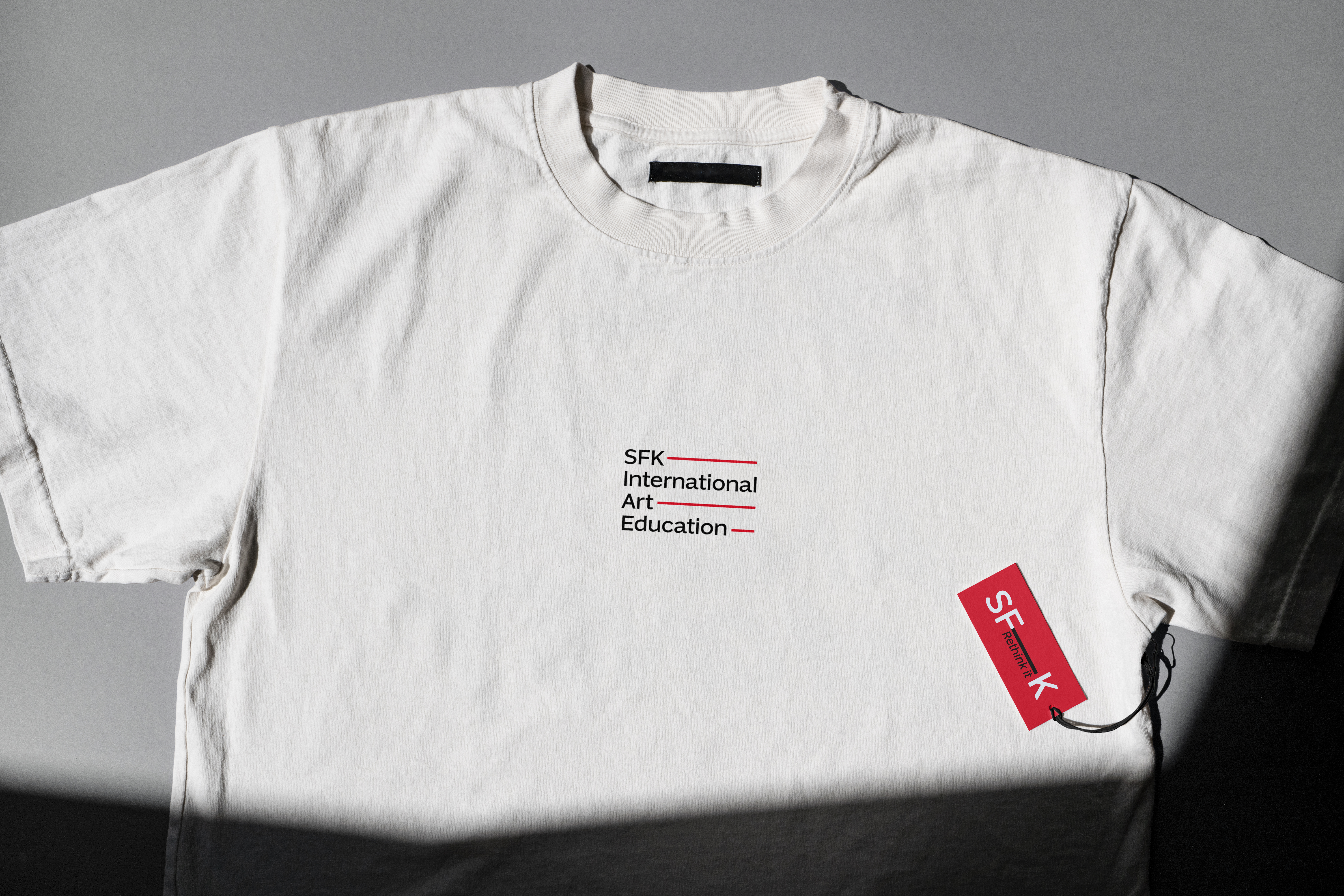
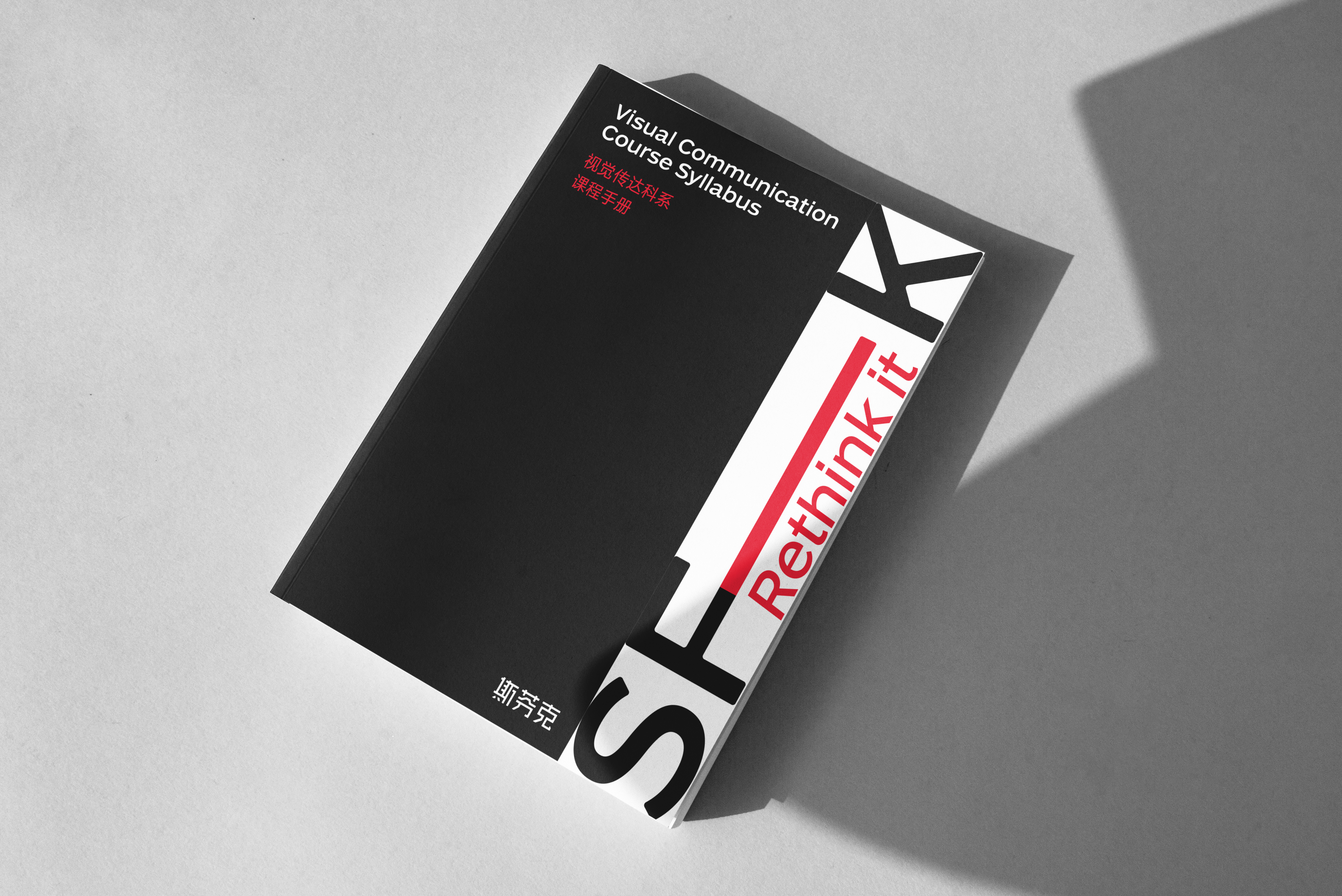
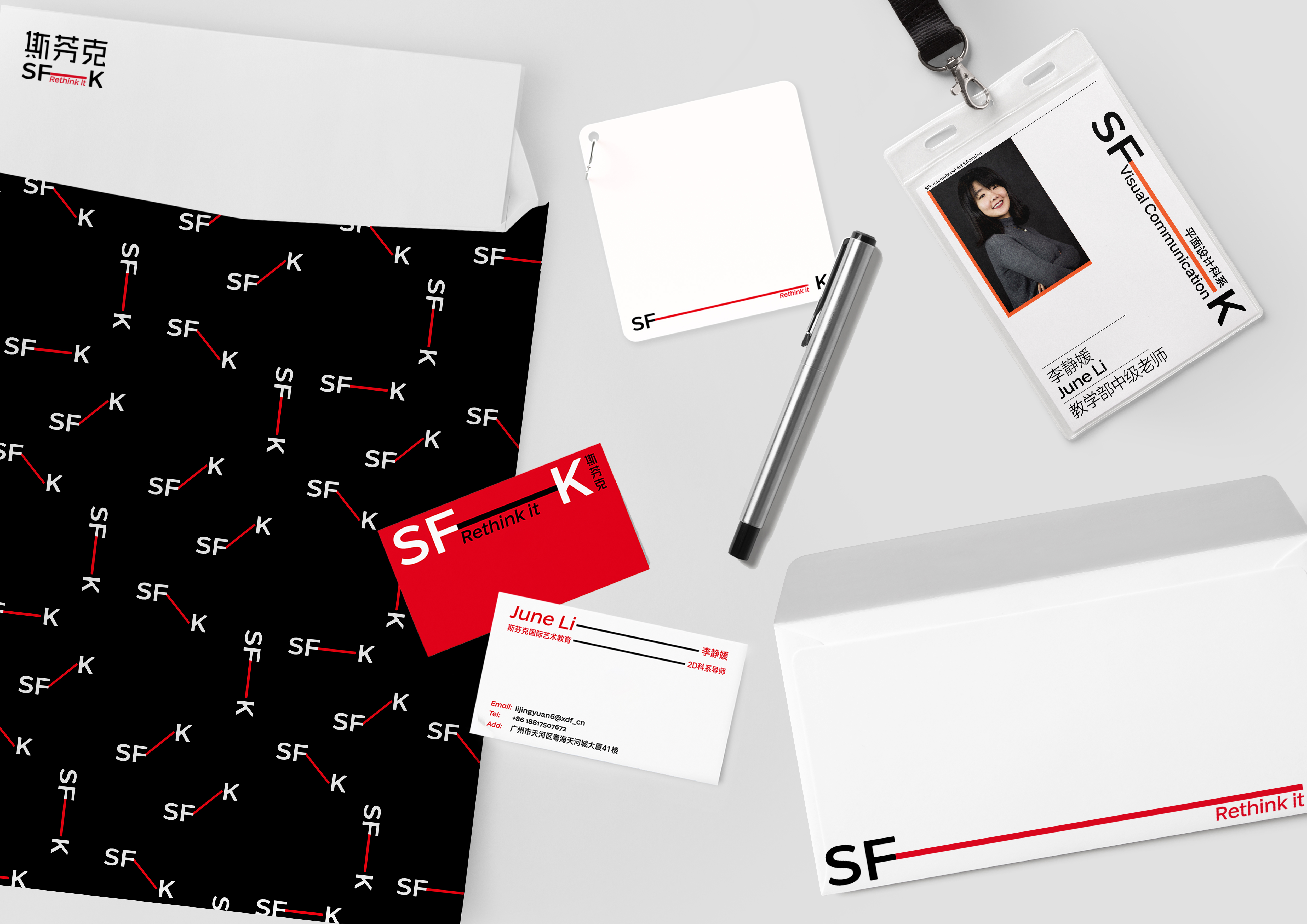
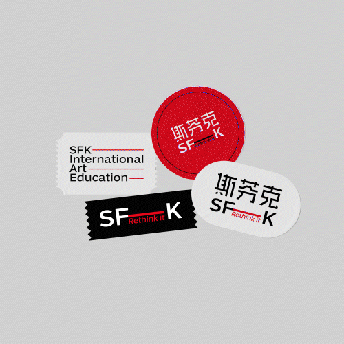
SFK IS AN ART EDUCATIONAL AGENCY. AS A ' BRIDGE', IT NOT ONLY LINKS STUDENTS TO THEIR IDEAL SCHOOL, BUT ALSO THEIR TEACHERS. THE WHOLE VISUAL IS BASED ON THE CONCEPT OF A BRIDGE, USING SIMPLE GEOMETRIC RECTANGLES COMBINED WITH ENGLISH LETTERS TO PROVIDE MORE ROOM FOR VARIATION IN THE IDENTITY, AND IN TERMS OF COLOURS, IN ADDITION TO USING RED AS THE MAIN COLOUR TO EXPRESS THE SENSE OF MISSION, DISTINCTIVE SECONDARY COLOURS HAVE BEEN ADDED TO EXPRESS THE DIVERSE, INCLUSIVE NATURE OF SFK'S SERVICES.